

PDF DOWNLOAD: We are creating a PDF Checklist that you can follow as you optimize your website. Click here to get notified when it is ready.
At the beginning of our website design projects, we cover how to create effective headers for your website. The header is the top section of your website, and is the focus of this post.
Typically, the top section of your website will feature your logo and a navigation bar that lists the pages on your site, as well as a call to action. Below that, you'll often find a hero section or an introduction to your website or the specific page.
Let's go through some actions you can take to improve the header area of your website so you can get happier customers and more sales coming in.
Optimization Tips for Easy Website Navigation
One of the most important things you can do to keep visitors on your website is to have clear and easy navigation. Your website's visitors will quickly leave your site if they can't find what they're looking for. Let's face it, you've probably done it yourself. Without clear direction, they’ll bounce off to a competitor whose site is easier to shop on (even if their offerings aren’t as good).
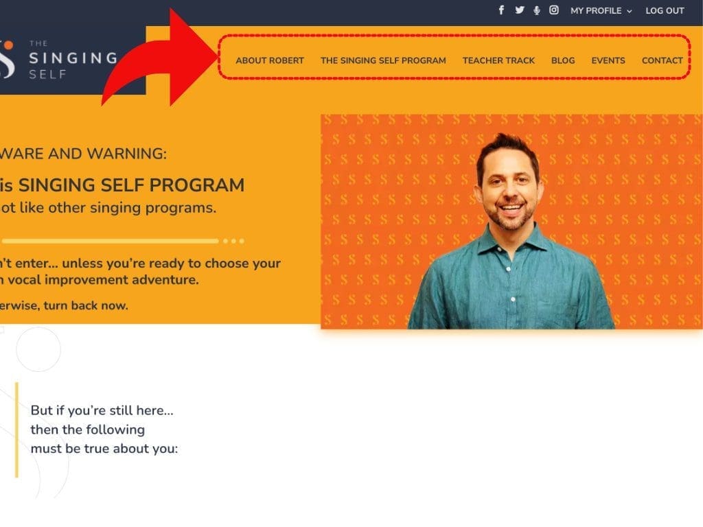
To optimize your navigation menu, use clear and concise wording, limit it to four to six links at the top, and include your most important pages at the top of the menu. When a user clicks on a menu item to go to a page, send them to a page with a longer title and a more descriptive explanation so they understand why they landed on that page and what they can expect to gain by continuing to read on that page.
The more time someone spends reading, browsing and learning on your site, the higher the chances become that they will convert into a warm lead or a paying customer. By creating a straightforward nav menu, you begin the process of optimizing your website for more conversions.
What Are the Most Important Website Pages to Include in the Navigation Menu?
When it comes to designing your website, the navigation menu is one of the most important elements to focus on. Your navigation menu should be designed in a way that is easy to use and understand for your visitors. It should include the most common pages that visitors expect to see when they land on your website.
The most common pages that you should include in your navigation menu are your homepage, about us page, and services page.
The most common pages that you should include in your navigation menu are your Homepage, About Us page, and Services page. Your homepage should be designed in a way that is easy to navigate, with a clear call-to-action that encourages visitors to take action. Your About Us page should be informative, and should help visitors learn more about your business and what you have to offer. Your Services page should be designed in a way that is easy to understand, with clear descriptions of the services that you offer.
If you have many offerings, consider using a drop down menu to list your top services, and include individual Service pages. This will make it easier for visitors to find the information they're looking for, and will help you organize your website more effectively. It's important to make sure that your offerings are clear and easy to navigate.
Another important page to include in your navigation menu, if it is applicable to your business, is an Events page. This page should provide visitors with a detailed overview of the events that you are offering. You can include a calendar with the dates of these events, and a place to book some of those events (purchase tickets or reserve you seat), or to view them if they're not bookable links.
Additionally, you can include a brief overview of the events, the speakers or performers, and their bios. Include photos and videos of past events whenever possible to help visitors visualize themselves participating in your events and to encourage them to take action. By providing a comprehensive listing of your events, you will help your visitors to plan their schedule and make the most of their time. Consider adding social media links on individual event pages or other ways for visitors to connect with the performers, speakers, or other attendees.
Next, your Contact page should be prominently displayed in your navigation. Depending on how you do business, this could also be moved to a full footer menu in your website. If you cringe at the idea of having a contact page on your website, you'll be surprised my tips in this article about why your contact page matters.
Your Contact page should go beyond simply providing visitors with your contact information. I always recommend including an FAQ section and easy-to-use forms that allow visitors to tell you exactly why they are reaching out to you. Giving them options to choose from in the contact form will guide them to find your services or offerings that are the best fit for their needs.
I wrote a complete blog on why you need a contact page for your website and what to include to get the most out of it, while weeding out the tire kickers.
Finally, a Blog page to house your articles should be included in the menu as well. Creating valuable content in the form of blog posts will allow your visitors to get to know your writing style and how you run your business. It’s a chance to give potential clients a taste of your knowledge and what they might expect to learn from you if they were to purchase your offerings.
Don’t sacrifice quality for quantity. I always recommend that my clients start with intent, stay on topic, and relate to their ideal clients when writing for their websites.
Keith J Eldridge
Although plenty of content can increase your chances of getting found and ranking higher in search results, quality and relevance is always the key to converting visitors into loyal, paying customers. Don’t sacrifice quality for quantity. I always recommend that my clients start with intent, stay on topic, and relate to their ideal clients when writing for their websites.
Keep in mind that the purpose of your website is to promote your valuable services, products and other offerings so you can create income and keep your business running. While selling may not always be the primary goal, it is important to remember that you are always offering something of value to potential customers.
Aim to strike a balance between professionalism and approachability when presenting your offerings and your website will be able to fulfill its job as the most essential component of your marketing machine.
Clear Navigation Menus Lead to Clear Customer Journeys
I’ll say it again, your navigation menu should be designed in a way that is clear and easy to understand. Make sure that all of your menu items are clear as to what they are linking to. This ensures that visitors are more likely to click on them, stay on your website longer, learn more about you and ultimately becoming your customer.
From a glance at the navigational menu, they should be able to choose where they are at in their journey with you. For example, if they are new to you and your brand, they may wish to start with the Services page to see what you offer. If they like what they see or if they’ve already been exposed to your brand through social media, they may want to learn more before taking action. In this case, they can find more about who they’ll be working with via your About Us page.
Clear navigation can drive up your search engine rankings. When configured properly, Google will find your nav menu and display it when your website shows up in search results pages. By showing the search engines that you have interesting, relevant content on your site, you make it easier to be found in organic searches and more enticing for searches to click through to your pages. This will play a crucial role in your SEO efforts as well.
Once a user clicks on your web page in the search results, your next goal is to introduce the products and services you have to offer them. Providing a clear path for the visitor to journey from finding you to learning what you can offer them increases their satisfaction and ultimately improves your lead generation process.
A user-friendly website means visitors are more likely to purchase from you. With these helpful tips, you'll be able to create a website that's fully optimized to turn visitors into customers.
Navigation Menu Best Practices for Improving User Engagement and Conversions
By now, you understand that the navigation area is where all the links to the pages most crucial to the success of your business reside. There are two common ways to handle how the menu functions as people read through your web pages. Most often, the menu will move off the top of the page as people scroll down and read through the content. Another strategy is what we call a “sticky navigation” that stays at the top of the browser, even after your begin to scroll. This allows constant, quick access to all your main pages as visitors browse through your site.
While there is a strong advantage to a sticky menu, it can also get in the way for people using devices with small or short screens.
Hamburger menus can save valuable space and allow you to add more items to your menu than a traditional menu across the top of the screen. As a result, they have become more common on desktop websites, not just mobile devices. These are menus that are hidden behind an icon, usually in the top right or left corner of the website, and look like three lines or bars stacked on top of each other. When clicked, a full menu will essentially slide out from the side.
While a clean design may be your goal, some visitors may have trouble recognizing that you have more content available through the hamburger menu. For this reason, some sites prefer a hybrid of traditional links at the top, with an extended menu behind the mobile style hamburger menu.
Regardless of the type of menu you choose for your website, ease of use and navigation should always be the main goal.
The Importance of Logo Placement in Website Design
Your logo should be placed in the top left corner, as this is where people expect it to be. It doesn't have to be large, as people simply want to recognize who you are without thinking about it. Web designers spend a lot of time and effort creating logos that can be recognized at a glance, rather than tasking the reader to study it to learn who you are.
Many case studies have been conducted on where the logo should be placed in your website header. The top left corner wins this, hands down. The second best place is in the center, but this can throw off your navigation menu’s balance.
You logo should be positioned in the top left corner of your website, memorable at a glance and not distracting from your content.
Keith J Eldridge
Statistics show that people are more likely to recognize your logo upon subsequent visits if they saw it in the top left corner for the first time. Therefore, it is almost always recommended to have your logo placed in the top left-hand corner of your website. It should be clearly visible but not in the way of navigation or distracting from the hero section, where you visitors are first called to action.
It's also worth mentioning that your logo itself should be simple and easy to recognize. If your logo is complicated, too large or has too much detail in it, people are less likely to recognize the next time they see it. And the whole purpose of a logo is quick and easy brand recognition.
How Call to Action Buttons Can Help Boost Your Website Sales
Your "call to action" is the next thing that you want to focus on. As a business, you're trying to sell something, and that's why you're investing your time and money into your marketing efforts. Your website is the center of those efforts and people will find it through many avenues, such as search engines and social media.
When people arrive on your site, they expect to learn more about you and how you can either solve their problem or make their life easier or happier. The first thing you want to let them know is that you want to sell them something. Of course, you’ll choose your wording and presentation elegantly to match your ideal client’s expectations.
Many small business owners often find it hard to say, “Please buy my stuff”, but it's important to remember that they came to your website looking for what you have to offer them.
You don't have to get their permission to offer them something because they're already on your website, looking for it. If they can't find out how to purchase your offers, they will go somewhere else and buy from someone else. So put your call-to-action in the top section, especially on your homepage. One of the best places to put it is in the top right corner. The number one action that you want people to take needs to be in that top right corner, because that's where they're going to look.
If you change your call to action too often, then people will get confused and leave. Keep your customers on track by being clear and intentional about what you're offering and how you offer it, both in your menu and in your calls to action.
On each page, you can go into more detail, but keep it clear and simple right from the start. Don't worry about being fancy in your wording or design. Make it very clear who you are and what you offer from the moment a visitor arrives on your site, at the top of your page and before they even start scrolling.
If your website is well-defined and easy to navigate with a user-friendly interface, the user journey will be very clear. Be intentional in your writing and don't get too fancy, or you risk confusing your customer and throwing them off.
Your potential client has these questions in mind when they reach your website, especially the first time.
- What is my first step?
- What should I do next?
- What is my last step after that?
- If I am not ready to buy, what are some other ways I can learn more about you?
- Can I read some of your blog articles to learn more about your writing, speaking, and thinking styles, as well as what you offer and what your skill sets are?
- Can I find your contact page to learn about your location if you offer in-house services?
- Can I find out the available times to contact you about working together?
All of these are important, and if you use too many complex words, you might confuse your customers and push them away.
Optimizing for Reader Scanning and Reading Behaviors
Most people read from the top left to the top right, and then they read down the page in a letter F style. They first go across, then down, and across again. As they scroll down the page, they continue to read in this pattern, or they may zigzag down in a letter Z pattern.
When people visit a website, they usually scan the page to see if there's anything interesting that would make them want to read more. Therefore, it's important to catch their attention by showing them who you are, your offerings, and what you want them to do, such as "Buy now", "Book a call", "Get a free lesson", or "Download my ebook." By getting them to take an action, they're more likely to take additional actions on your website as they become more familiar with you.
So, the first tip is to check out your navigation area, the links in your menu and your call to action (CTA).
Wow, we just went through a lot of top-grade tips didn't we! Let sum that up so you can take action.
What to Include in Your Hero Section for Maximum Impact
Your logo should usually be located in the top left corner of your website. If possible, you should also have a call to action in the top right corner. However, if you have a lot of menu items, you may be limited on space. For this reason, consider your navigation menu contents carefully.
If your call to action doesn't fit in the menu, place it directly below the menu in your main header area, which is sometimes called a hero section. If you have a large image in this area, placing a call to action below the menu ensures that it is visible to visitors. Try to have at least one call to action in this section, and possibly two (but no more than two).
You can have the same call to action in both the top right corner and in the center of your hero section. For example, if you have a "book a call" button in the top right corner, consider having another one in the header area. This repetition helps visitors understand what they need to do in order to work with you. In addition, make sure the call to action buttons are the same color and design.
If possible, include a picture of yourself or images of your ideal clients using your product. For instance, if you are a speaker, include pictures of you on stage or giving a workshop. If you are a piano instructor, include pictures of your students performing at a recital or concert.
Your website should be customer-oriented, so make them the heroes. Include happy pictures of your clients doing what you teach them to do best. If you don't have a picture, consider using a premium stock photo. In either case, make sure it looks authentic and relevant to your brand.
PDF DOWNLOAD: We are creating a PDF Checklist that you can follow as you optimize your website. Click here to get notified when it is ready.
How We Help You Launch Your Website with our Website Projects and Strategy Sessions
The QuickStart Website Project is a service I developed to help small businesses and owners in the creative industry launch their websites quickly. On average, it takes about eight weeks to complete the project. The turnaround time depends on how much you have prepared before we begin and how much effort you're willing to put in. We provide everything you need to get started and stay on track, including checklists to guide you along the way. Custom website projects get more involved and can take quite a bit longer to complete, but they'll start the same way as a QuickStart Website project.
Before we get started, I have you fill out a form that outlines all the things you'll need for your website. The first thing we do is what I call a "baseline generator session," which can also be called a strategy session or discovery session. During this session, we identify your goals for having a website, including the features and benefits that your customers will enjoy, and the amount of sales you want to make. With this information, we can begin the process of creating a website that converts your visitors into buyers.
Next, we go through everything you've got prepared, for example:
- Do you have copy already written for your pages?
- Do you need assistance with that?
- Do you have a lead magnet ready? - a way for people to download or get something for free to learn more about you, so that you can get their contact information and send them more valuable information, so that they can prepare to buy?
- Do you have your branding already set up?
- Do you have a logo? If so, do you need it updated (maybe because it's huge, off-brand and distracting)?
- Do you have a color palette?
- Do you have typography guidelines to go with your brand?
- Do you need help with updating or creating any of this before we get started?
We'll also document all your social media profiles and gather hosting information. I'll gather everything I need from you ahead of time, and we'll go through everything step-by-step together. I'll tell you what to do, what you need, and how to get it, so you don't have to figure it out yourself.
Over the years and through many projects, we've found that a few things can slow down a website project’s progress, such as struggling to write copy or not having clear messaging. In those cases, it's often best to hire a copywriter to help you out (we can help with that). Another issue is images; gathering your photos and any other necessary documentation can take time.
The most common show stopper though is simply not taking the time to “just do it”. We help you stay motivated by created a clear strategy and project timeline with action items distributed across the project to help you stay motivated and productive.
And if the timing is right, you may be able to join one of our QuickStart Website Project “Cohorts” where we bring a group of business owners together in a guided accountability group to process and launch their website design projects together! (Get on our newsletter if you want to find out when the next one rolls around.)
Key Takeaways: Optimize Your Website to Convert More Visitors into Buyers
In conclusion, optimizing your website to convert more visitors into buyers is crucial for the success of your business. By focusing on clear and concise navigation, including the most important pages in your menu, placing your logo and call-to-action in strategic areas, and creating valuable content, you can make it easier for visitors to find what they're looking for and take action.
At Keith Dream, we specialize in helping small business owners in the creative industry, such as voice teachers, music teachers and learning & development professionals, launch their websites quickly and effectively. We offer a variety of website design projects to fit your needs.
If you're interested in learning more about our services and finding the right website design project for your business, please visit our Services page. You can also book a "quick call" with us to discuss your needs so you get started on your website design project.
[PDF DOWNLOAD: Click here to get a PDF Checklist to follow as you optimize your website]
FAQs for Website Header Sections
- What are some best practices for creating clear and easy navigation menus?
- Use clear and concise wording, limit it to four to six menu items, and include your most important pages at the top of the menu.
- What are the most important website pages to include in the navigation menu?
- The most common pages most websites should include in the navigation menu are your homepage, about us page, and services page.
- What is the importance of logo placement in website design?
- Your logo helps create brand recognition. Let your visitors know where they are by placing your logo in the top left corner of your website, as this is where people expect it to be. You may be tempted to creatively add your logo somewhere else on your website, but studies have shown that it reduces the likelihood that visitors will recall it when they see it again.
- What is the hero section of a website?
- The hero section is the section of the website that immediately follows the navigation header. It usually contains an image, a video, a slider, or a call-to-action. It is the first thing that visitors see when they arrive on your website, and it should clearly communicate what your business does and how it can help your visitors. It is also a good place to include your call-to-action buttons, as visitors are more likely to take action when they are presented with a clear and compelling offer. When designing your hero section, make sure to keep it simple, clear, and focused on your visitors' needs and desires.
- How can I optimize my header area for more sales?
- When designing your website header, focus on creating a clear and easy-to-use navigation menu that allows visitors to quickly and easily find the information they're looking for. Include effective calls-to-action that encourage visitors interact, whether it's to buy a product, book a consultation, or download a resource. Finally, clearly demonstrate the valuable content you can offer visitors, such as blog posts, useful resources and case studies, that showcase your expertise and provide value to your audience. By prioritizing these elements in your website design, you can improve the customer journey and increase the likelihood of converting visitors into buyers.
- What are some tips for call-to-action buttons?
- Place your call-to-action in a prominent location, such as the top right corner or below the menu in your hero section. Use clear, intentional writing to encourage visitors to take action. Keep your CTAs consistent so they know how and when to take action.
- What is a Quickstart Website design project?
- The QuickStart Website Project is a service designed by Keith Dream to help small business owners, such as teachers and voice studio owners, in the creative industry launch their websites quickly and effectively with the ability to scale when ready.
PDF DOWNLOAD: We are creating a PDF Checklist that you can follow as you optimize your website. Click here to get notified when it is ready.
Attribution: Online illustrations by Storyset


0 Comments